The Local Authority NCC (Newcastle City Council) wants to know how to target current initiatives and resources to reduce fuel poverty and CO2 emissions from existing privately rented and owner occupied housing stock. As part of the aims to deliver the Energy Master Plan for the city, NCC wants to prioritise resources against the worst performing areas of the city in relation to energy efficiency.
The Energy Officer believed the application of the SEMANCO visualisation tool could be of some assistance in development and planning of energy strategies. The Energy Officer consulted his/her manager about the benefits of the tool and both agreed to pay a one off discounted fee to trial the SEMANCO tool for a period of three months to see how it could be of assistance to them.
With access to the tool and training in place, the Energy Officer working for NCC has been asked by his/her manager to use the tool to produce a report appraising three options to reduce carbon emissions of domestic dwellings in the Kenilworth Road area of Newcastle upon Tyne. The Energy Officer uses the MCDA tool to assess the attributes of three proposed plans to improve the energy efficiency of the housing stock in a specified neighbourhood. Each of the plans is assessed against three indicators in the MCDA tool, SAP improvement, CO2 reduction and Energy Consumption (kWh).
The steps in this process are outlined below:
1. Identifying target areas.
The target areas are identified by searching in the urban model and filtering the information using specific indicators.
1.1. Exploring the model
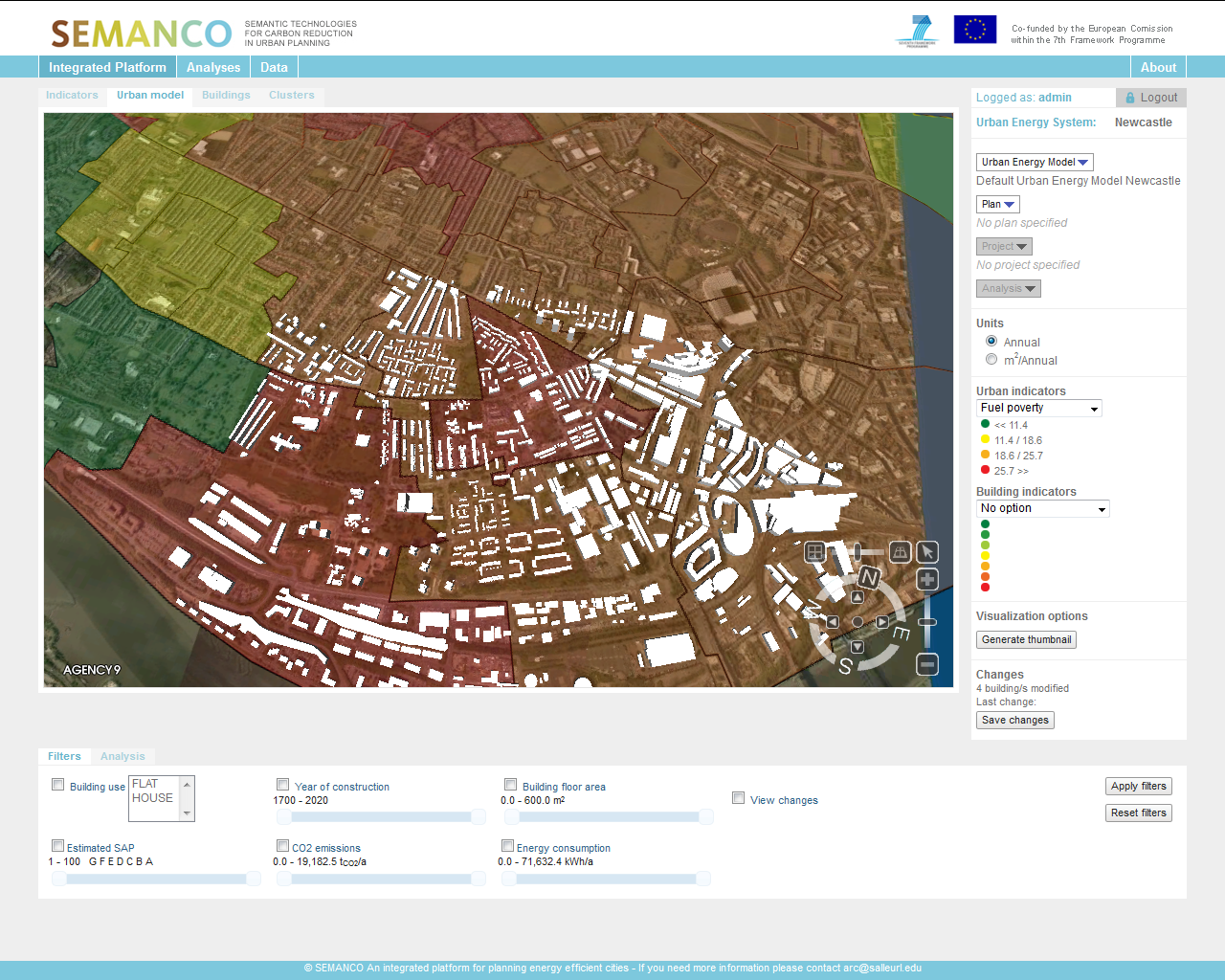
The user zooms further into the model to focus on a particular neighbourhood illustrating low levels of income. With the neighbourhood identified the consultant selects ‘Energy Consumption’ from the performance indicator drop-down icon.
2. Loading the urban energy model.
The user loads an urban energy model for the City of Newcastle.
2.1 Selecting an urban energy model
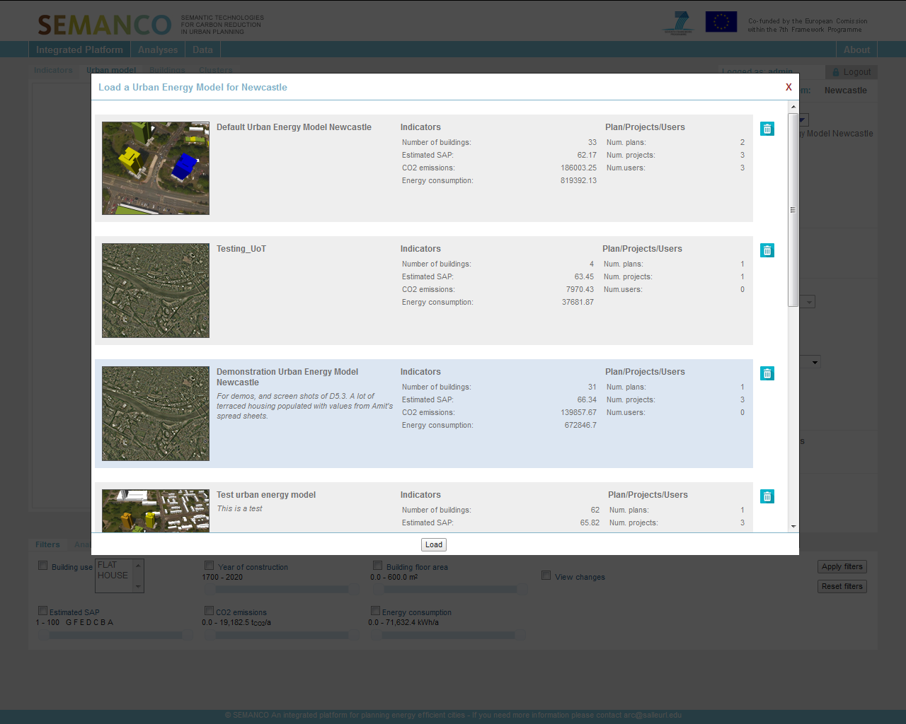
The user selects load from the drop-down menu and a series of urban energy models appears. The user is presented with a summary of each model and a supporting statistical summary. In this case the user selects ‘Demonstration Urban Energy Model Newcastle’. Again the user has previously worked on this model and is re-accessing it to illustrate the results to his client.
2.2 Selecting SAP indicators
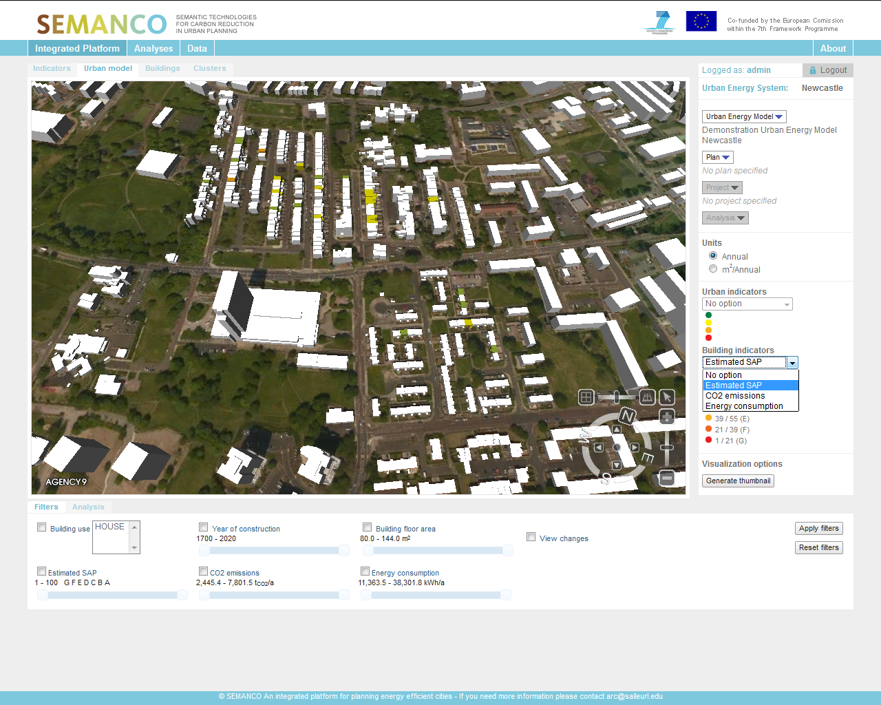
The buildings with SAP information aligned to them are highlighted indicating their SAP level. The user moves along to the next tag in the SAP tool and can review the heating data aligned to the property. The shading illustrates pre-loaded SAP calculations for households in the neighbourhood. The user is interested in dwellings located on Kenilworth Road and can visualise the current energy performance of these dwellings using the map.
3. Creation of a new plan and projects.
The user loads plan for the Kenilworth Road area. The user has pre-loaded the plan based on earlier data analysis.
3.1 Loading the plan.
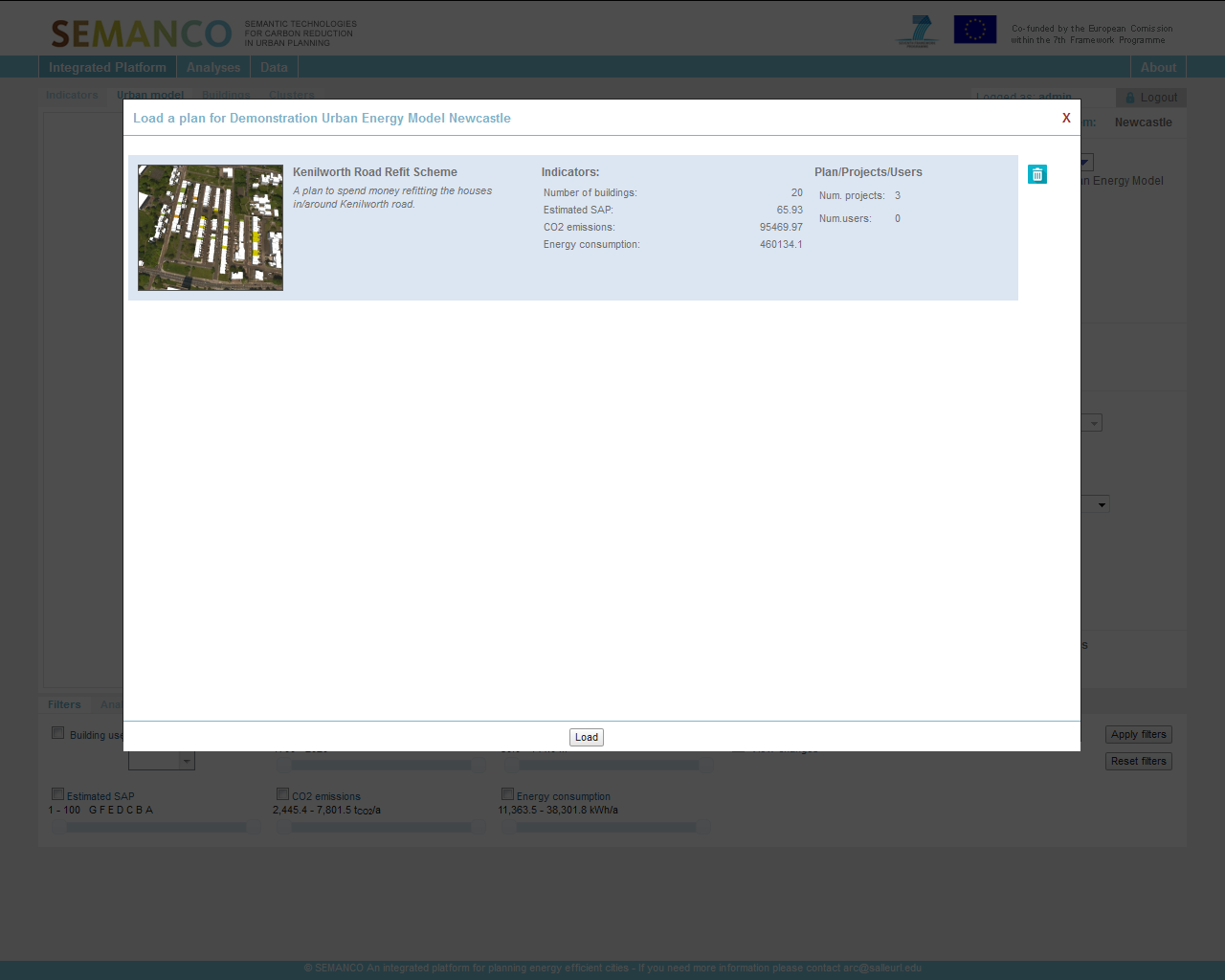
The user is presented with a summary screen for the plan. The plan can be loaded by selecting the ‘load’ icon at the bottom of the screen. Once the plan has been selected from the drop-down menu a summary page pops up to show a pre-loaded plan previously developed by the user. The page illustrates a visualisation of the area in question, the name and key attributes aligned to it, including KPIs and Indicators (CO2 and SAP rate). The view also illustrates the number of projects within the plan, in this case three and the number of users contributing to the plan.
3.2 Loading a project
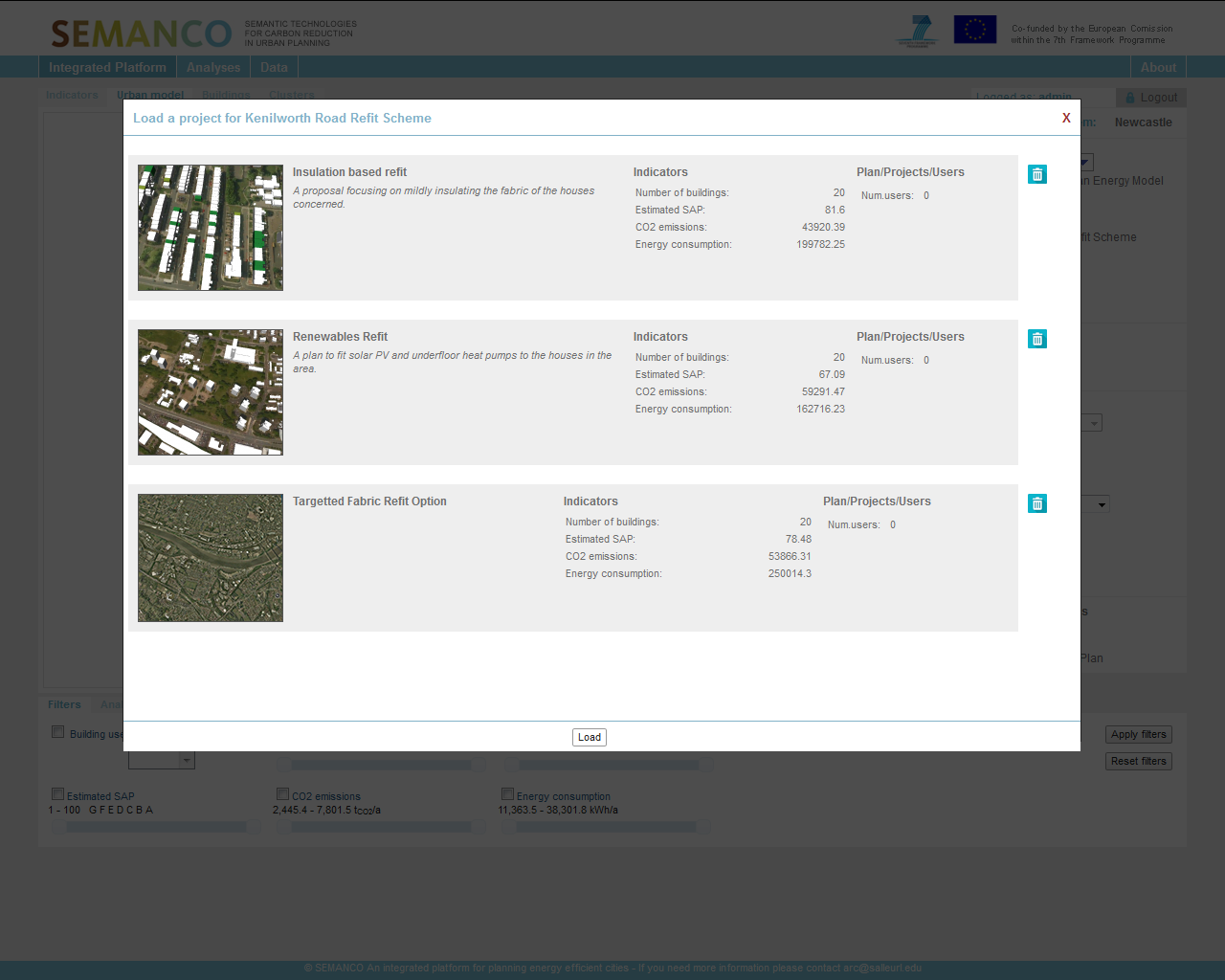
Once the plan is loaded, the user is presented with a list of projects. The user is able to select the three projects within the plan by selecting the project then clicking on “Load” from the drop-down menu as illustrated. Three projects for Kenilworth Road have been developed by the user and are proposed for the area. The pop-up image illustrates the nature of each refit proposed and a summary of the indicators including estimated SAP if applied, CO2 emissions and Energy Consumption (kWh). The user selects insulation based refit simply by clicking on it and pressing load at the bottom of the screen.
3.3 Visualizing a plan and project

Here the user can review the baseline plan (before) and project (after) energy efficiency interventions.
3.4. Visualising a plan and a project
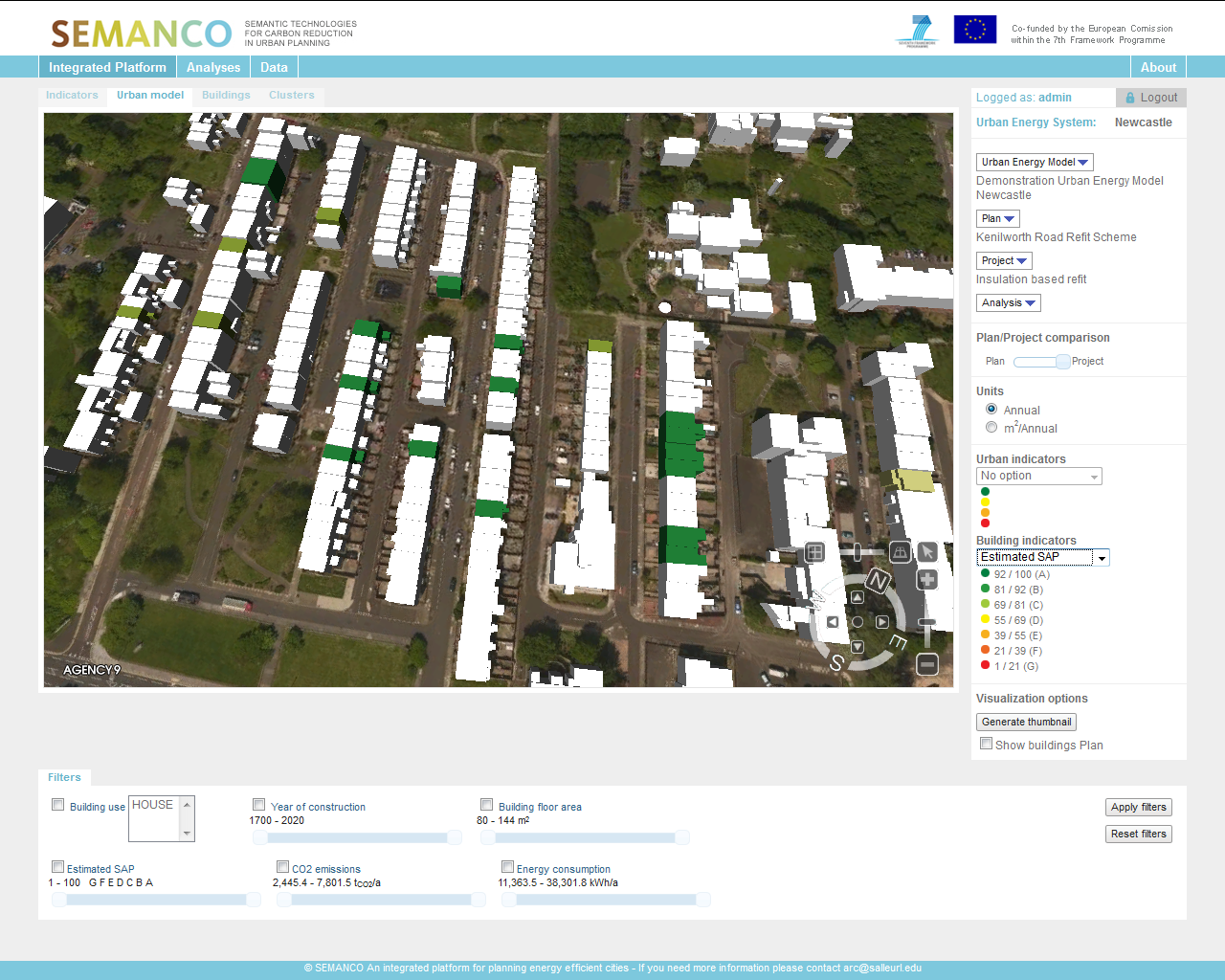
The user can view the energy performance improvement post interventions indicated by the SAP ratings. The user has now selected an urban energy model, a plan within the model and a project. The view illustrates the results of the insulation based retrofit project to the client. The user can see where they are within the visualisation platform and has the opportunity to switch between the plan (pre-intervention) and project (post-intervention) illustrating how the dwellings SAP rate can be improved on Kenilworth Road.
4. Multi-criteria analysis.
The MCDA tool is loaded within the platform as part of the process to begin comparing projects against each other
4.1. Multi-criteria analysis
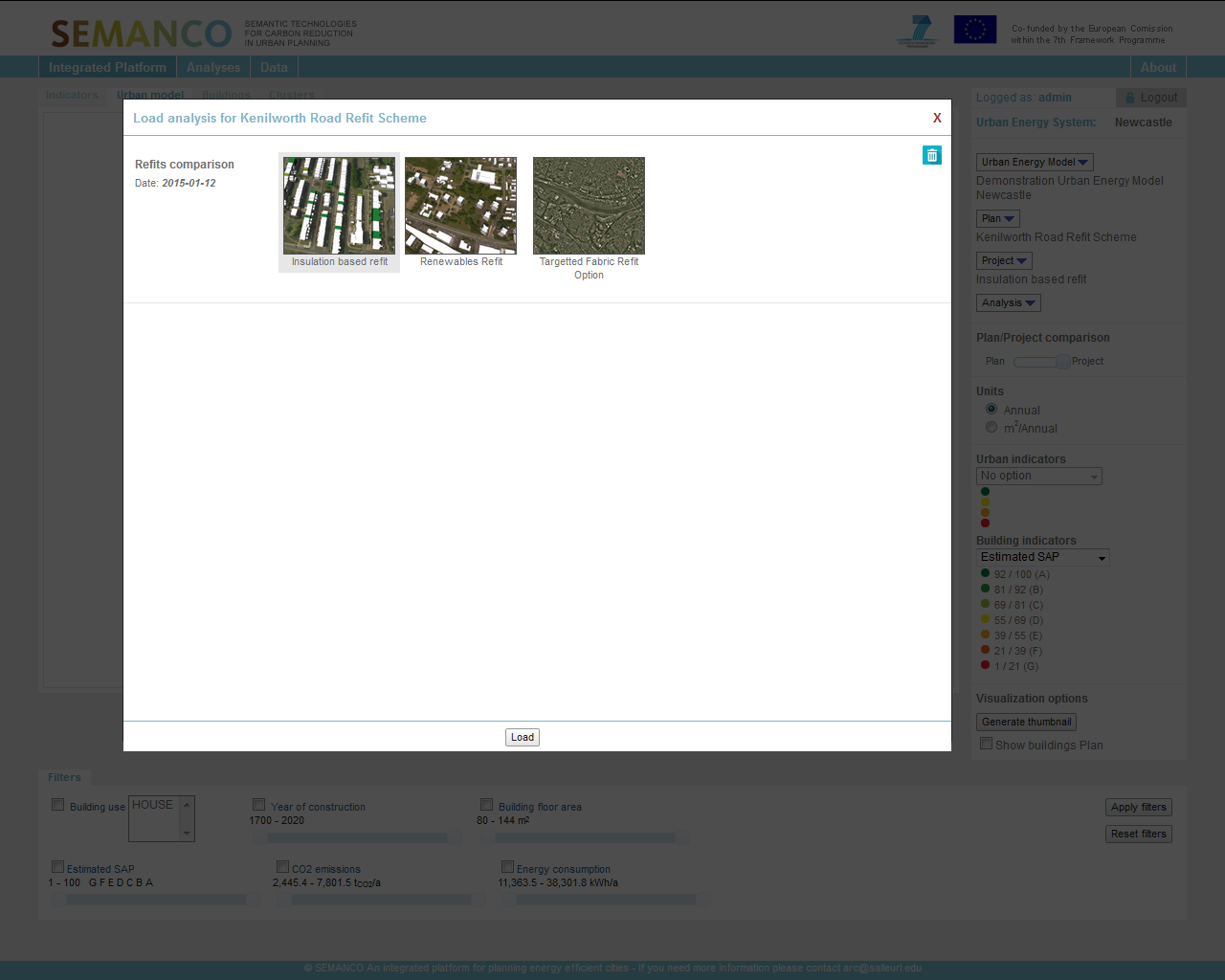
Three projects are identified ready for comparison. The user is able to see the three retrofit programmes set out, an insulation based refit, a renewables refit and a targeted fabric refit. The user can also see the baseline for the Kenilworth Road Refit Scheme, however this can be removed from the refits comparison by clicking on the scheme and removing it by clicking on the bin icon on the right hand side of the window.
4.2. Assessing the analysis
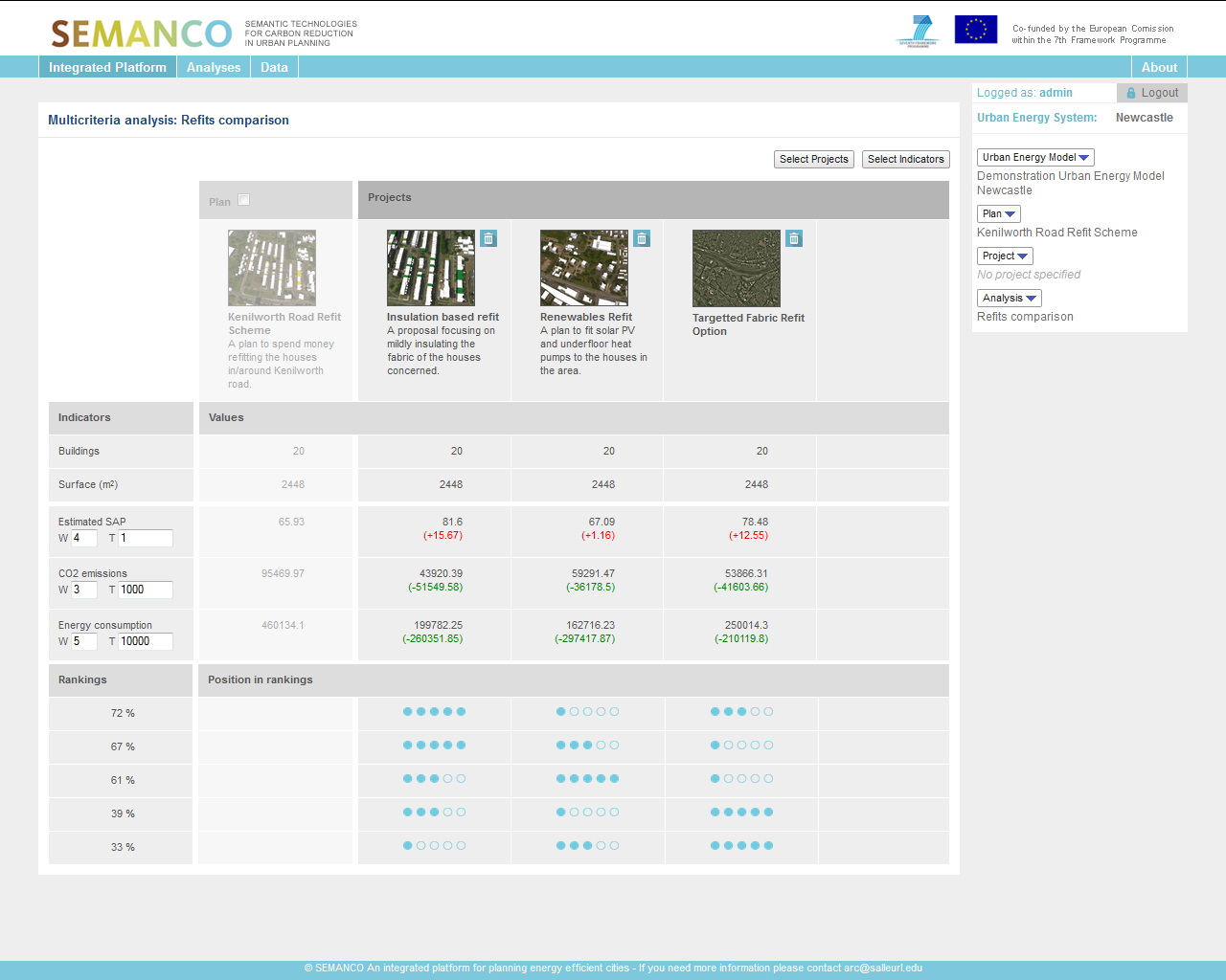
Results from the MCDA tool are presented together with their rankings. The user is now able to see a detailed summary window of the three refit comparisons set out in the MCDA tool. There is functionality to add another project to the calculation if the user wishes to do so.The user is now able to see the three refit comparisons set out in the MCDA tool. The user can see a summary of each performance indicator, estimated SAP, CO2 emissions and energy consumption (kWh). Using the unit measurements on the right hand side of the window, the user can set weights and threshold measurements based on their own local priorities and preferences. The results of the comparison are then presented as rankings illustrating how each project performs against the desired indicators.
4.3. Interpreting the analysis

The results presented on this screen enable the user to see that an ‘Insulation based retrofit’ has been scored above targeted fabric upgrade and renewables refit. Using this screen the user can select each proposed option and see the score aligned to that option. The findings displayed are used to evaluate the different energy retrofitting options. The user can extrapolate this information and feed it back to his/her management to assist them in making a commercial decision as to which option is the best solution.